I built this project with Power BI to make Eurostat’s Harmonised Index of Consumer Prices (HICP) easier to explore in a way that is both comparative (across countries/regions) and decomposable (down into category, year, quarter, and month). The core deliverable is a Power BI report backed by a semantic model. The model standardizes time handling, country labeling, and category ordering so the visuals behave predictably under slicing and drill-down.
On top of the report, I added a lightweight Streamlit application as a companion UI. It reuses the same conceptual structure date range, country/region filters, COICOP categories, and metric selection in a web-first layout.
The result is a workflow where the Power BI file is the analytical source of truth for modeling and curated visuals, while the Python app offers an alternate way to browse the same series with a narrower deployment surface. The emphasis is not on novelty, but on engineering discipline in data shaping, metric definitions, and interaction design across two runtimes.
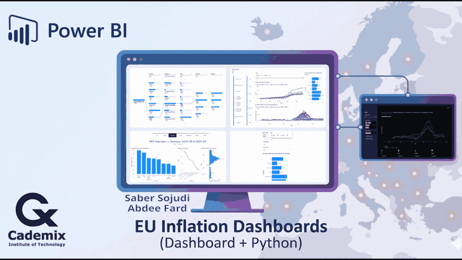
Saber Sojudi Abdee Fard
Introduction
When inflation spikes or cools, the first question is usually not “what is the number,” but “where is it coming from, and how does it compare.” I built this dashboard around that workflow: start from an overview (index and inflation rate trends across selected countries/regions), then move into composition (category contributions and drill paths), and finally allow per-country “profile pages” that summarize the category landscape for a given period.
A second requirement was practical reproducibility. The Power BI report is the main artifact, but I also added a small Streamlit app so the same dataset can be explored outside the Power BI desktop environment. The intent is not to replace the report; it is to provide a simpler, web-native view that preserves the same filter semantics and metric definitions.
Design constraints and non-goals
I kept the scope deliberately tight so the visuals remain interpretable under interactive filtering. The report focuses on a curated set of countries/regions and a small COICOP subset that supports stable labeling and ordering, rather than attempting to be a full Eurostat browser. The time grain is monthly and the primary series is the HICP index (2015=100), with inflation rates treated as derived analytics over that index. I also treat “latest” values as a semantic concept (“latest month with data in the current slice”) instead of a naive maximum calendar date, because empty tail months are common in time-series exploration.
This project is not a forecasting system and it does not attempt causal attribution of inflation movements. It also does not try to reconcile HICP movements against external macro variables or explain policy drivers. The Streamlit app is not intended to reproduce every Power BI visual; it is a companion interface that preserves the same filter semantics and metric definitions in a web-first layout.
Methodology
Data contract and grain
The model is designed around a single canonical grain: monthly observations keyed by (Date, geo, coicop). In Power BI, DimDate represents the monthly calendar and facts relate to it via a month-start Date column; DimGeo uses the Eurostat geo code as the join key with a separate display label (Country); and DimCOICOP uses the Eurostat coicop code as the join key with a separate display label (Category) and an explicit ordering column. Facts are intentionally narrow and metric-specific (index levels, inflation rates, weights), but they share the same slicing keys so a single set of slicers can filter the entire model consistently.
The Streamlit app enforces an equivalent contract at ingestion. It expects a monthly index table that can be normalized into: year, month, geo, geo_name, coicop, coicop_name, and index, plus a derived date representing the month start. Inflation rates are computed from the index series within each (geo, coicop) group using lagged values (previous month for MoM, 12 months prior for YoY), which implies a natural warm-up period: YoY values are undefined for the first 12 months of any series.
Data sourcing and parameterization
On the Power BI side, I structured the model around an explicit start and end month (as text parameters) so the report can generate a consistent monthly date spine and align all series to the same window. This choice simplifies both the UX (one date range slider) and the model logic (all measures can assume a monthly grain without defensive checks for mixed frequencies).
The dataset is handled via Power Query (M) with a “flat table” approach for facts: each table carries the keys needed for slicing (time, geography, COICOP category) and a single numeric value column per metric family (index, rates, weights). At the report layer, measures are responsible for turning these fact values into user-facing metrics and “latest” summaries in a way that respects slicers.
Semantic model design
I modeled the dataset as a star schema to keep filtering deterministic and to avoid ambiguous many-to-many behavior. The design uses a small set of dimensions (Date, Geography, COICOP category) and multiple fact tables specialized by metric type (index levels, month-over-month rate, year-over-year rate, and weights). This separation lets each table stay narrow and avoids overloading a single wide fact table with columns that do not share identical semantics.
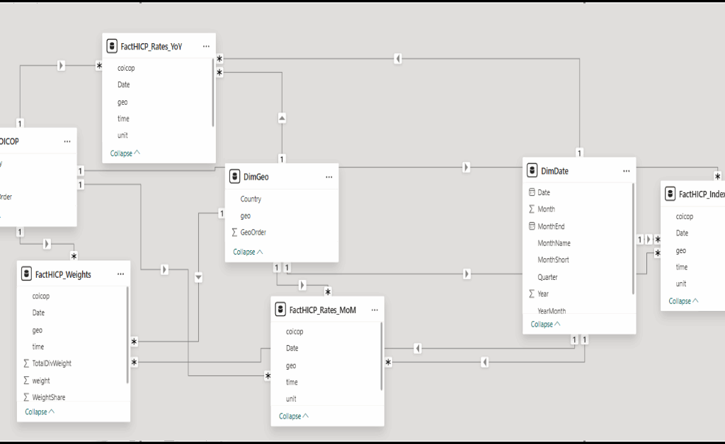
Figure 1: The semantic model is organized as a star schema with Date/Geo/COICOP dimensions filtering dedicated fact tables for index, rates, and weights.
Metric definitions and “latest” semantics
To keep the report consistent across visuals, I centralized calculations into measures. At the base, index values are aggregated from the index fact. Inflation rates are computed as ratios (current index over lagged index) minus one, expressed as percentages. This makes the definition explicit, auditable, and consistent with the time grain enforced by the date dimension.
For “latest” cards/bars, I avoid assuming that the maximum date in the date table is valid for every slice. Instead, a dedicated “latest date with data” measure determines the most recent month where the base metric is non-blank under the current filter context, and the latest-rate measures are defined as the metric evaluated at that date. This prevents misleading “latest” values when a user filters to a subset where some months are missing.
To keep the date slicer from extending beyond the available series, I also apply a cutoff mechanism: a measure computes the maximum slicer date (end of month before the latest data), and a boolean/flag measure can be used to hide dates beyond that cutoff. This improves the interaction quality because users are not encouraged to select an “empty” tail of months.
Report UX and interaction design
The report is organized around a small set of high-signal experiences:
- An overview page combining (a) index trajectories by date and country, (b) an annual inflation rate time series view, and (c) a “latest annual inflation rate” comparison bar chart.
- A drillable decomposition view that starts from an annual inflation rate and walks through country, category, year, quarter, and month.
- Per-country overview pages that summarize category-level annual inflation, category index levels, and the distribution of annual rates over time (useful for “what was typical vs. exceptional”).
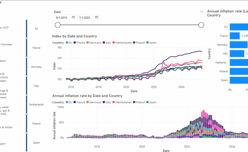
Figure 2: Overview layout: date filtering and COICOP selection drive index and inflation charts, with a “latest annual inflation rate” bar for quick comparison.
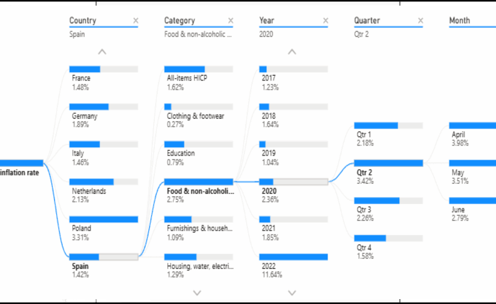
Figure 3: Decomposition path: annual inflation rate is broken down stepwise by country, category, and calendar breakdowns to reach month-level context.
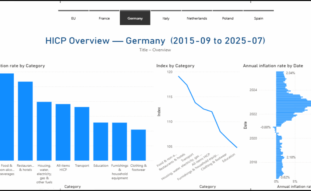
Figure 4: Country view: a dedicated overview page summarizes category inflation, category index levels, and the time distribution of annual inflation for one country.
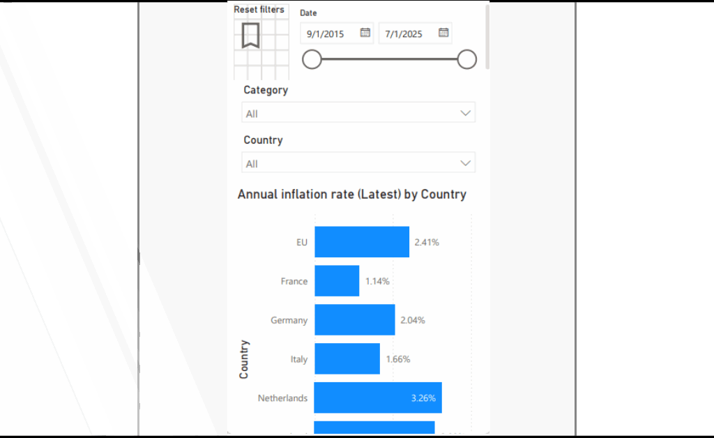
Figure 5: Mobile-focused view and Streamlit companion UI: a compact “latest annual inflation rate by country” experience paired with a simplified filter panel. a filter-first sidebar and tabbed exploration views for annual YoY series, index trajectories, and supporting tables.
Companion Streamlit app architecture
The Streamlit app mirrors the report’s mental model: choose a date range, countries/regions, COICOP categories, and then explore one of several views (annual rate, monthly rate, index trajectories, and supporting tabular outputs). I designed it as a small module set: a main entrypoint for page layout and routing, helper utilities for data prep, a filters module to standardize selection logic, and a tabs module to keep view-specific plotting code isolated.
For correctness, the app also includes a simple “guardrails” strategy: it flags implausible month-over-month values (for example, extreme outliers) rather than silently accepting them. This is not a substitute for upstream data quality work, but it is a practical way to prevent a single malformed row from dominating a chart in an exploratory UI.
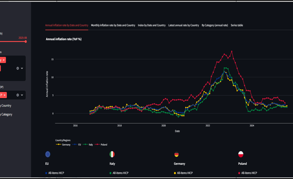
Figure 6: Streamlit companion UI: a filter-first sidebar and tabbed exploration views for annual YoY series, index trajectories, and supporting tables.
Key implementation notes
Key implementation notes
The Power BI deliverables are hicp_eu27.pbip / hicp_eu27.pbix. The semantic model metadata is stored under hicp_eu27.SemanticModel/definition/, and the report metadata is stored under hicp_eu27.Report/.
Core analytics are centralized in measures. The model defines base measures such as Index, Monthly inflation rate, and Annual inflation rate, and it also implements “latest-with-data” semantics through Latest Date (with data) and Annual inflation rate (Latest).
Time filtering is kept honest through explicit cutoff logic. Measures such as Max Slicer Date and Keep Date (≤ cutoff) prevent visuals and slicers from drifting into months that exist in the date table but do not have observations in the selected slice.
Report visuals are defined explicitly in the report metadata. In practice, the report uses a line chart for index trends, a ribbon chart for annual inflation over time, a clustered bar chart for latest annual inflation comparisons, a decomposition tree for drill paths, and tabular visuals for series browsing.
The Streamlit companion app uses app/main.py as the entry point, with app/tabs.py, app/filters.py, and app/helpers.py separating view logic, filtering semantics, and shared UI utilities. Static flag assets are stored under app/flags/.
Interaction model
I designed the interaction model around how people typically reason about inflation: compare, drill, and then contextualize. The overview experience prioritizes side-by-side comparisons across countries/regions over a shared date range, with a small number of visuals that answer distinct questions: the index trajectory (level), the inflation rate trajectory (change), and a “latest” comparison (current snapshot). Slicers are treated as first-class controls date range, country/region, and COICOP category and the model is structured so those slicers propagate deterministically across all visuals.
For decomposition, I use an explicit drill path rather than forcing the reader to infer breakdowns across multiple charts. The decomposition view starts at an annual inflation rate and allows stepwise refinement through country, category, and calendar breakdowns (year → quarter → month), so the reader can move from headline behavior to a specific period and basket component without losing context. The per-country pages then act as “profiles”: once a country is selected, the visuals shift from comparison to composition, summarizing category differences and the distribution of annual rates over time.
In the Streamlit app, the same interaction principles are implemented as a filter-first sidebar plus tabbed views. Tabs separate the mental tasks (YoY trends, MoM trends, index levels, latest comparisons, and an exportable series table), while optional toggles control how series are separated (by country, by category, or both) to keep multi-series charts readable as the selection grows.
Results
The primary success criterion for this project is interaction correctness: slicers and filters must produce coherent results across different visual types without requiring users to understand measure-level details. In practice, the report behaves as intended in three “validation checkpoints.”
First, the overview page supports side-by-side country comparisons over a single monthly date range, while remaining stable under COICOP category selection. The index plot and inflation-rate visuals update together, and the “latest annual inflation rate” bar chart remains meaningful because “latest” is defined by data availability rather than by the maximum calendar month.
Second, the decomposition view provides an explicit reasoning path from a headline annual rate into a specific country/category and then into calendar breakdowns. This reduces the need to mentally join multiple charts: the drill path is encoded in the interaction itself.
Third, the per-country overview pages turn a filtered slice into a “profile” that is easy to read: which categories have higher annual inflation, how category indices compare, and how annual inflation distributes over time. This design is particularly useful when the user wants to compare the shape of inflation dynamics across countries rather than just comparing single-point estimates.
Discussion
A recurring design trade-off in this project is where to place logic: in Power Query, in the semantic model, or in the application layer. I chose to keep the facts relatively “raw but standardized” (keys + numeric values) and then express most analytic intent in measures. That makes the metric definitions inspectable and reduces the risk that a transformation silently diverges from what the visuals imply.
Another trade-off is scope control. The model is deliberately constrained to a set of countries/regions and COICOP categories that support clean ordering and readable comparisons. This improves the story and the UI, but it also means the model is not a general-purpose Eurostat browser. If I were productizing this, I would likely add a “wide mode” that dynamically imports more categories and geographies, alongside a curated “core mode” that preserves the current report design.
Finally, the Streamlit app demonstrates portability, but it also introduces the need to keep metric definitions aligned across two runtimes. I mitigated this by mirroring the report’s concepts (metrics, filters, and guardrails) rather than trying to recreate every Power BI visual. The app is most valuable when it stays narrow: fast slicing, clear trend lines, and a readable series table.
Ten essential lessons
- I treated the monthly grain as non-negotiable. Everything keys to
(Date, geo, coicop). - A star schema keeps cross-filtering stable when multiple fact tables share dimensions.
- “Latest” must be semantic, not
MAX(Date). I used “latest-with-data” for KPIs. - I applied an explicit slicer cutoff to avoid empty trailing months.
- Stable ordering improves readability. I used explicit order columns for geos and categories.
- Scope control is a UX feature. I constrained geos and COICOP groups for interpretability.
- Narrow facts preserve provenance. Index, rates, and weights remain distinct.
- In Streamlit, I centralized filtering so every tab uses the same selection semantics.
- Exploratory dashboards need guardrails. I null extreme MoM/YoY values.
- Responsiveness matters. I cache ingestion and use layout strategies for dense selections.
Conclusion
This project is a compact example of how I approach analytics engineering: define a stable monthly grain, build a star schema that filters cleanly, centralize metric semantics in measures, and design visuals around the user’s reasoning path rather than around chart variety. Power BI is the primary artifact, and the Streamlit app is a pragmatic companion that reuses the same filter-and-metric concepts in a web-first UI.
The next step is straightforward: document the model decisions (especially “latest” semantics and cutoff logic) directly inside the repo, and decide whether the Streamlit app should read from an exported model snapshot or from a shared data extraction step to reduce drift risk.
References
- S. Sojudi, “Eurostat-HICP: Power BI HICP dashboard and Streamlit companion app,” GitHub repository, 2025. https://github.com/sabers13/Eurostat-HICP.
- Microsoft, “Power BI documentation,” Microsoft Learn. https://learn.microsoft.com/power-bi/.
- Microsoft, “Data Analysis Expressions (DAX) reference,” Microsoft Learn. https://learn.microsoft.com/dax/.
- Microsoft, “Power Query M language reference,” Microsoft Learn. https://learn.microsoft.com/powerquery-m/.
- Streamlit, Inc., “Streamlit documentation,” 2025. https://docs.streamlit.io/.
- Plotly Technologies Inc., “Plotly Python documentation,” 2025. https://plotly.com/python/.
- Eurostat, “Harmonised Index of Consumer Prices (HICP) data and metadata,” 2025. https://ec.europa.eu/eurostat/web/main/data/database.
- Eurostat, “Eurostat data web services (API) documentation,” 2025. https://ec.europa.eu/eurostat/web/main/data/web-services.